The familiar “boop-beep-boop” of dial-up internet’s digital cogs turning, hours spent trying to somehow understand any pattern or logic behind Minesweeper, and piles and piles of floppy disks.
Technology in the 1990s was a wonderful thing. And amidst the ordered chaos of new startups, acquisitions and mergers, there was one company that stood out from the rest – America Online, or AOL.
The internet giant, famed for playing an important role in bringing the world wide web to the masses, had begun the next phase of its meteoric growth. With the acquisitions of Compuserve and Netscape, as well as large-scale investment in the likes of Hughes Electronics, AOL had started to cement its position as a technology pioneer by the end of the decade. With the dawn of a new millennium, however, the tide started to turn for AOL. Having concluded what was (at the time) the biggest ever merger between two companies, the birth-child of AOL and Time Warner began to struggle. Growth targets were not being met, accounting irregularities were brought before the US Justice Department, and unwavering criticism eventually led to the resignation of AOL’s founder, Stephen Case.
With its position under threat from the likes of Google, Yahoo! and MSN, the company that once found itself listed as the fourth most important thing to have shaped the internet (behind the web, email and graphical user interfaces) found itself in a precarious position. It was adapt or die.
The underlying reason behind the slow decline of AOL in the early-mid 2000s was a combination of the changing landscape of the world wide web and the company’s failure to anticipate the future. Not only had the worldwide shift from dial-up connection to broadband left AOL bereft of its core identity, but new upstarts such as Google and Yahoo! were stealing their ad revenues in broad daylight. And, critically, subscribers were leaving en masse for free email providers such as Hotmail and Yahoo. For “America’s darling of the internet”, it was clear: big changes were needed for it to survive.
The first of these big changes came on 12 March 2009 when Tim Armstrong, former top advertising executive at Google, was named chairman and CEO of AOL. Two weeks later, it was announced that the company would spin-off from Time Warner and become an individual entity once again. It quickly sold Bebo, the now monumentally unpopular social networking site, back to its founder for $1 million, $849 million less than it had acquired it for.
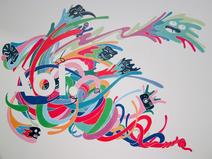
The company also pivoted towards a new focus on programmatic ad buying and acquisition of new media outlets such as TechCrunch and The Huffington Post, which it acquired in September 2010 and February 2011 respectively. With the new leadership focused on repairing the damaged reputation of AOL, an image change was also required. So, in partnership with brand consultancy, Wolff Olins, AOL relaunched with a brand new identity.

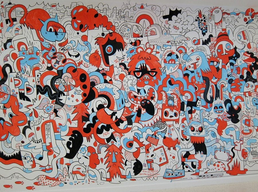
AOL's rebrand was attention (and traffic) grabbing. Source: Scott Beale/Laughing Squid.
While the rebrand hasn’t propelled AOL back to the heady heights it reached in the late 1990s – we’re not seeing millions of people cancelling their Gmail accounts and signing up to AOL – it has done exactly what the beleaguered unicorn needed it to do: restore some of its reputation and establish its new focus. And while many eyebrows have been raised over it, there are, without doubt, a few lessons that any business can learn from the rebrand, and rebirth, of AOL.
Assess where you and your customers are at
It’s evident that AOL’s rebrand was borne out of an understanding of where the brand sat at the time, not where it wanted to be. Whilst many examples of a large-scale rebrand indicate where the company wants to be, AOL took a different route to rebrand itself. It spoke to its old customers. It spoke to the millions of millennials who regarded AOL as “Dad’s Internet”. It spoke to the people who thought it was outdated, out-of-touch and obsolete. And whether you like the design or not, it worked. Within months of the rebrand, AOL was the only major brand to have a higher online 'buzz' score than major brands such as Google, Facebook and Yahoo. Its stock price went up 135% in 2012, and new users and previous customers returned to the platform.
One thing that remains to be seen
is whether AOL truly understood where
it
stood in the marketplace. To truly understand whether your existing or
potential customers will be receptive of a rebrand, it’s important to take a
step back and look at your brand proposition. What do
you think you offer your customers? What do you actually offer your customers? Where are
the gaps in your offering? Why are your potential customers using your
competitors? What is the competition offering that you’re not? Where are you
losing customers in your funnel? Use any customer research, data or trends at
your disposal to design with them in mind. It’s easy when rebranding to get
sucked in to a cycle of opinion, influence and change based on nothing but
emotion. Something that looks great to one person looks awful to another, and this is
no more apparent than when undertaking something as important as a rebrand.
Instead, try and base everything from design elements like logo, colour and
typeface to new features and products on real data and customer insights.

Wolff Olins was tasked with helping AOL become a 'media company for the 21st century'. Source: Laughing Squid.
Design for now, design for the future
One inherent characteristic of online behaviour that is confusing to many people is the automatic hate that a rebrand, or even just a new logo, inevitably generates. Airbnb fell prey to it. As did Google. Even Microsoft. The only reason that Facebook generally avoided widespread criticism with its new logo in 2015 was that the changes they made were so subtle, most didn’t even notice.
But AOL needed something big. It needed something striking. It needed to tell the millions of customers who had jumped ship that it was back, that it was different. Not only was its model outdated, but its branding had been left behind by the strikingly current design, style and image of its competitors. What was once a “cool” company was now seen as the brown corduroys of the tech world by the audience that mattered, and the audience that used the internet the most – millennials.
By cleverly utilizing bold, eye-catching colour, negative space and a consistent typeface, the new logo served as a good anchor to build the rebrand on. It allowed for countless different uses and could be adapted to fit a certain product, service or offering. The different use cases make it easy for the logo to fit in across a massively diverse world wide web, with backgrounds ranging from goldfish to animated monsters, spacemen and geometric patterns. The monotone wordmark and simple typeface creates a contrast between the abstract background and the clear and concise AOL logo.
It may split opinions amongst the graphic designers, marketers and keyboard warriors of the web, but it does two things brilliantly. Firstly, it puts across a message – that amongst the crazy and cluttered web, there is AOL. Whether that is what the leadership team at AOL and Wolff Olins originally intended remains to be seen, but it is, nonetheless, a positive message put across almost instantly. Secondly, AOL designed for the future. Nothing puts across a message of inconsistency and confusion like a constantly changing brand. AOL has now got a brand that could, realistically, save the company from falling victim to the constantly evolving online society.
Don’t rebrand for the sake of it
With its position as an internet giant in question and, more importantly, its entire existence in jeopardy, wholesale changes were needed to save AOL. The easy route would’ve been to just rebrand and relaunch the business. But would that have saved it? Probably not. And whilst, admittedly, its popularity hasn’t reached anywhere near the levels it once enjoyed, its position is now a lot more secure. Having pivoted away from its old, core business model, AOL realized and accepted the monumental shift in online behaviour.
With consumer choice greater than ever before, brand loyalty is becoming a thing of the past. If a business can no longer provide the features that its customers want, they’ll just leave. The AOL of the 1990s could get away with charging customers for its email platform, but although there are still companies charging for such features, the larger user bases now belong to its free counterparts, such as Gmail, Outlook and Apple Mail. AOL could get also get away with not having certain products, as users didn’t have many other options. But all of that has changed, and AOL had to respond.
A rebrand, let alone a complete relaunch, is an incredibly daunting prospect. The potential for a backlash amongst your customer base is very real and, done carelessly, could do lasting damage to your new brand. But if, like AOL, a change needs to happen, a rebrand may make sense for your business. Go into it with an open mind. Prepare to throw out your preconceptions and be proved wrong. And ultimately, be willing to take your company down a route you hadn’t initially considered. It could revolutionize your business.


These cookies are set by a range of social media services that we have added to the site to enable you to share our content with your friends and networks. They are capable of tracking your browser across other sites and building up a profile of your interests. This may impact the content and messages you see on other websites you visit.
If you do not allow these cookies you may not be able to use or see these sharing tools.